How Color Psychology Influences Marketing and Branding Design

calendar Mar. 27, 2025
sepcialist avatar

Siranush Tovmasyan

Head of Visual Content

main_image
Summary. Learn how to create trust, excitement, or happiness and keep your brand top of mind with color. Discover why consistent...more

Table Of Contents

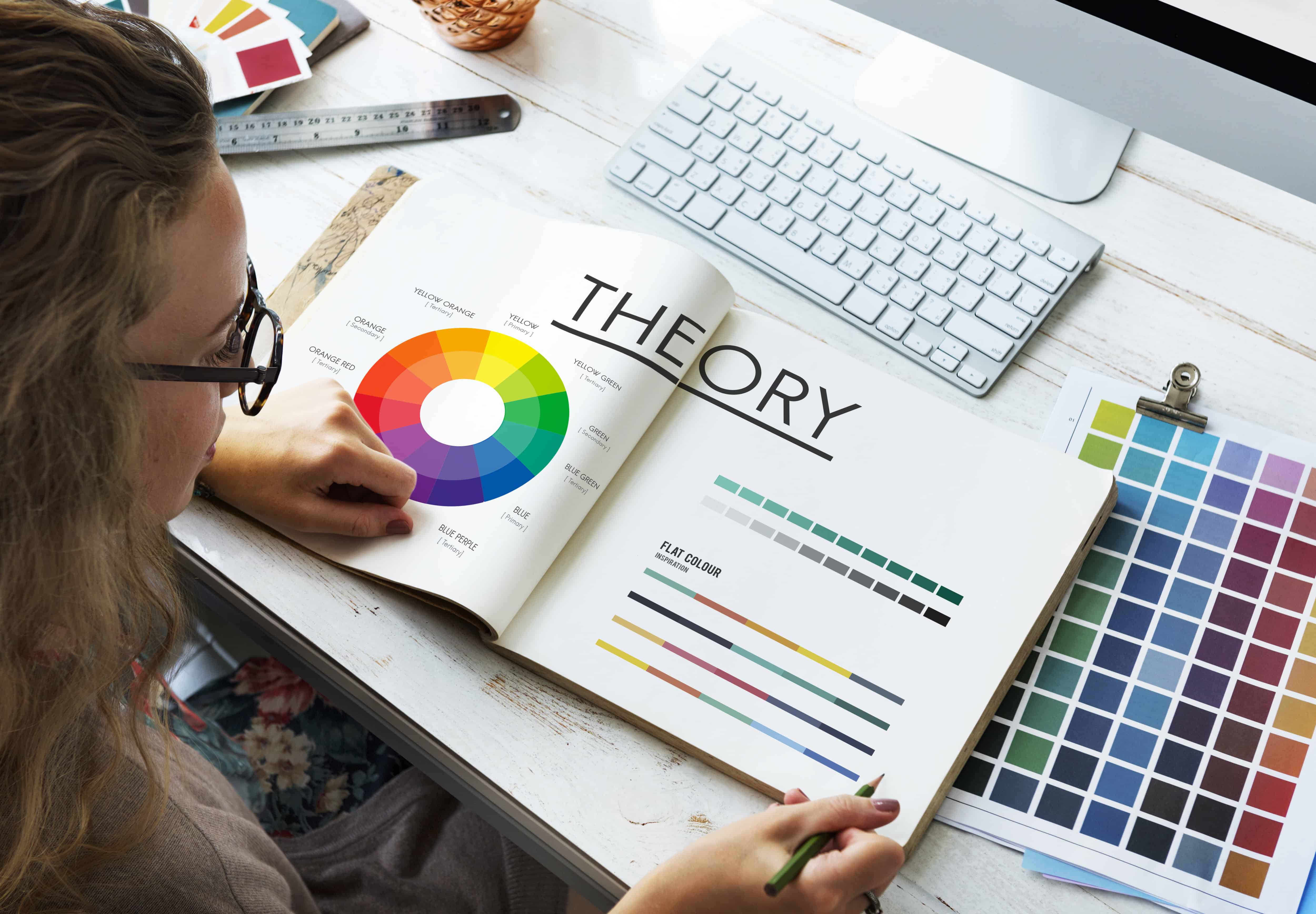
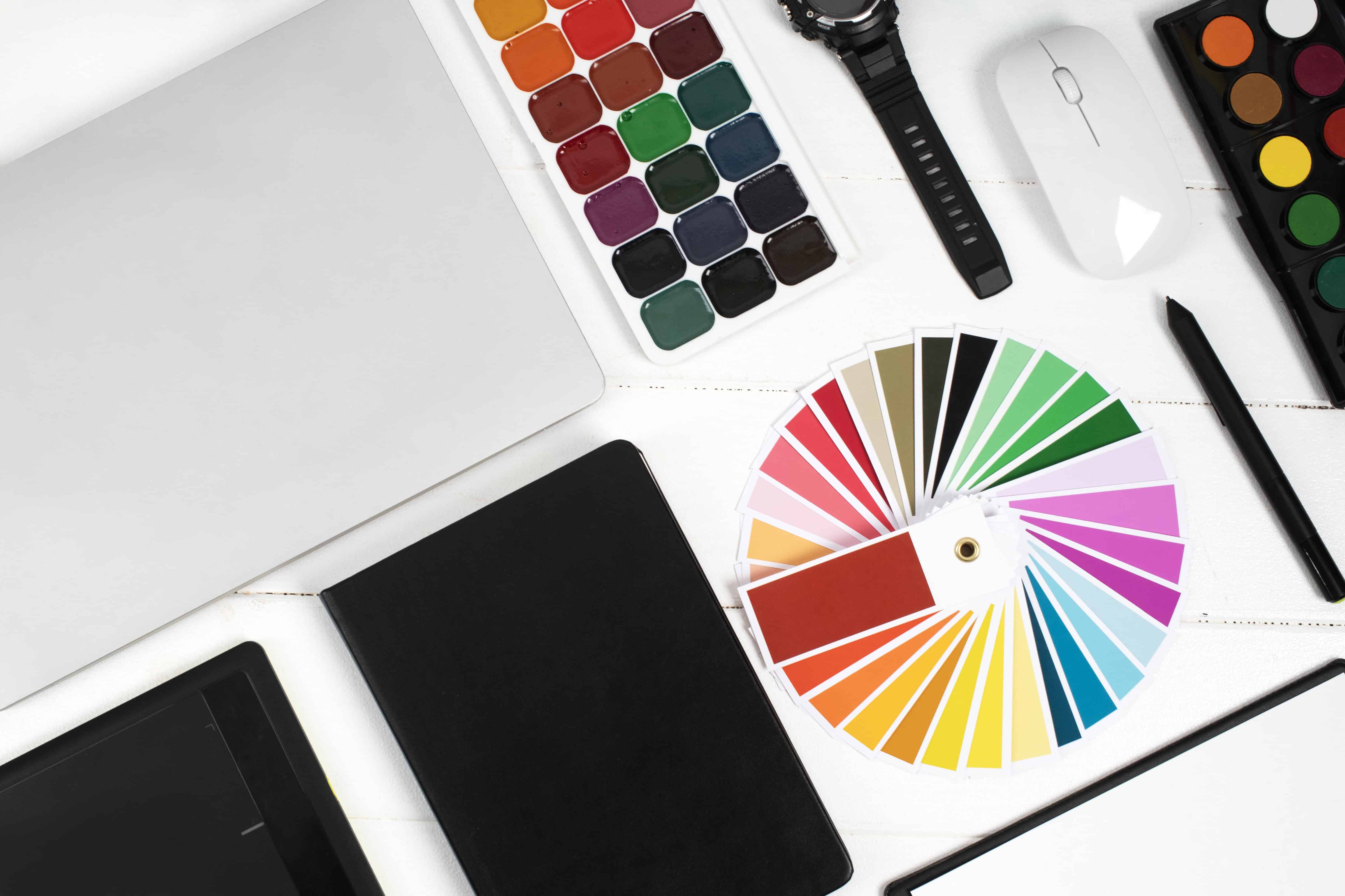
Have you ever felt like colors can influence your behavior and mood? For example, maybe you have felt that red makes you feel hungry or energized. Or maybe you felt calm because of blue or green. Or maybe yellow brought you happiness. Or you never paid attention. Anyway, research states that there’s color psychology in design. It is the discipline that focuses on the interaction of colors with feelings, actions, and decisions. Hence, for strategic marketers and branding design gurus, this idea possesses the power of insight to reach the targeted public.

Imagine your favorite brands. What is the first thing that comes to your mind? Most of the time, it is their colors. We are not talking here of colors that are randomly chosen: the red of Coca-Cola, the yellow of McDonald's, or the blue of Tiffany’s. These colors are chosen to reflect the character of a brand and to encourage certain feelings in the customers.

Competitive factors are also involved in color uniformity, but in marketing and branding, color psychology in design is not only aesthetic. It is about appealing to people’s deep-seated mental patterns to generate impactful designs. This blog will discuss how the psychology of color influences decision-making in marketing and branding and why it is relevant to business organizations in today’s market.

Marketing and Branding – Why Is Color Important

Colors are not just used to enhance the look of products and designs; they inform a story. In the context of marketing and branding design, color always plays the first view. It carries an implication that is as direct and stylish as it can become and leaves a first impression.

Every tube owner would gladly name such a brand as Coca-Cola or Apple, and nobody would say otherwise. Coca-Cola's color is so full of energy that it creates associations with an active and happy life, while Apple’s color is clean and symbolic of technological advancement. These brands understand the choice of colors well; they choose colors that support the image and values of the brands.

Further to this, colors not only bring recognition but also create emotions. Red can prompt action or passion and, therefore, is perfect to signal a sale or a promotion. Blue creates trust and reliability, which is why it is used by banks and tech industries. Yellow elicits happy and optimistic connotations, and that is why it is often used by brands that try to convey a friendly and happy attitude to the company. When brands paint in vision and perception with the mission and message of their brand, they create a link with the audience. The efficient choice of colors is capable of resulting in higher reliance, intensified loyalty, and even boosted sales figures.

color-in-marketing


What is Color Psychology?

Color psychology is the branch of psychology that is concerned with the impact that colors have on the human mind. It’s partly a science fueled by an understanding of how the brain perceives images and shapes and partly an art based on interpreting the feeling and symbolism given to colors. For instance, green means nature, health, and growth. So black is viewed as a smart color and something dominant, while pink is viewed as a gentle and benevolent color. These relationships are not just random; they are at our subliminal level of mental operation.

It's valuable for marketers and designers to grasp the side of color psychology in design because the former helps to convey information nonverbally. For instance, when a designer uses warm colors for a health food brand, it will immediately give a signal to a consumer that the food is natural and wholesome. Equally, a technology company could set out its gear in sleek blues and greys to come across as ultra-modern and trustworthy. Understanding color psychology in graphic design assists firms in striking feelings with the intended audience, which cannot be done in any way by writing.

Colors in Marketing

In marketing, we find that colors in marketing take a central position. From the web design to the email campaign to the social media posts, the right colors can also make all the difference. It’s not about making things nice to the eye; it’s about controlling user interactions and encouraging an activity. For instance, the call-to-action buttons are usually red or orange since they elicit instant admiration. 

For instance, blue is universally used in website navigation menus because it gives a user a sense of calmness or trust. These thousands of micro-moments can translate into big differences in terms of brand engagement from the users. Digital marketing is very visual, and colors must be kept consistent. A website’s color, email color, and social site color are all one. If the brand uses a single color repeatedly, it establishes trust with the customer. This is where color psychology in design proves its importance once more, providing consistency and trustworthiness across all touchpoints.

Color Psychology in Video Production

Video production is one of the most popular types of content today, and color is one of the most important aspects of its success. Fewer colors used in videos mean better looks and a stronger brand image, which is another advantage of cohesiveness in terms of color.

Suppose there is a travel brand that is to produce a video advertisement. Bright yellows, deep blues, and rich green are not only marvels of nature but are selected to stimulate the desire for a vacation or trip. It inspires the target market to act – to book a vacation – here, on the Hill, where all these amazing sights can be found.

Color continuity, when used on video content, is even more important because the brand is easily recognizable and trusted regardless of the nature of the videos being used. Knowing what color grading is in video editing can also enhance the impact of these visual choices.

color-psychology-in-video-production


Color Psychology in Advertising

In advertising, color psychology in graphic design comes to light. Whether it is external advertising, such as a billboard, or internal one, such as a package or even a retail display, colors work wonders in getting attention, having the right emotional appeal, and selling!

Let’s discuss the example of packaging. When it comes to picking colors, we find that many snack brands prefer using red or yellow, as they both tend to make one feel hungry and excited. On the other hand, luxury products are inclined to use black, gold, and white to nod to the prestige of the brand.

Examples of graphic design in advertising show how color is applied in print ads to transmit simple messages. Fitness ads might use bright and intensive colors, such as orange and red, while instrumental advertisements of spas might be related to less intensive tones, such as blue and green. Styling is conscious and designed to elicit a particular feeling in the viewers and readers targeted by each decision.

So, in physical stores, which people still visit, colors are used to dictate the actions of the customers. The warmth of colors in a store can help to attract and entice customers; on the other hand, cooler tones encourage a more laid-back atmosphere

Advantages and Disadvantages of Color Psychology

However, colors must be employed so that they can be effective. Whereas, if one or more colors are used excessively, it tends to make the target design look very crowded and complicated. On the other hand, using the wrong colors will only paint the wrong picture of your business to the public and potentially scare off clients.

The next issue has to do with cultural differences in color perception. In the cultural contexts of Western societies, white is strictly connected with purity, and weddings, in some Asian cultures, symbolize mourning. While red may be associated with luck and joy in one cultural context, it can also signify anger or danger in another cultural context. Knowledge about your public and the conditions under which your colors shall be seen is very vital. These are issues that global brands need to pay special attention to to avoid falling foul.

Adapting to Changing Trends

Fashion colors exist in cycles, and equipping yourself with knowledge of them can go a long way for your brand. For instance, the so-called pastel colors that emerged in the recent period are indicative of the growing adoption of design minimalism. However, something that is in vogue should never override brand image.

Probably, the goal is to achieve a balance here, to take on board news trends, but at the same time, retain the message of the brand. This flexibility makes sure that the specific brand still resonates with the consumers while avoiding confusing customers by changing the brand’s basic characteristics to call frequently.

Conclusion

Colors are not mere decorations but forms of message as well as means of addressing one another. Through color psychology in design, there is a way in which businesses can control the feelings and even the general attitude of the people towards it.

From initial product introduction, perceptions, and relationship building, the right color can take a brand to another level entirely. This paper has further explained how colors in marketing have been used and how the effects of technology and design trends will make color’s use in marketing even more paramount in the future.

So, the next time you design a logo, plan a campaign, or create content, ask yourself: What can be read from the choice of these colors? Ensure that it is a memorable one for your target group or the intended client.

Share this article

advertising trends